Line Plots
Overview
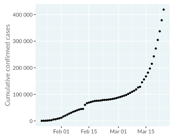
Line plots are similar to scatter plots but connect consecutive data points. They are especially useful when the x-axis represents dates or times. For example, a scatter plot of worldwide COVID-19 cases in early 2020 becomes clearer when points are connected with a line.
Multiple Lines
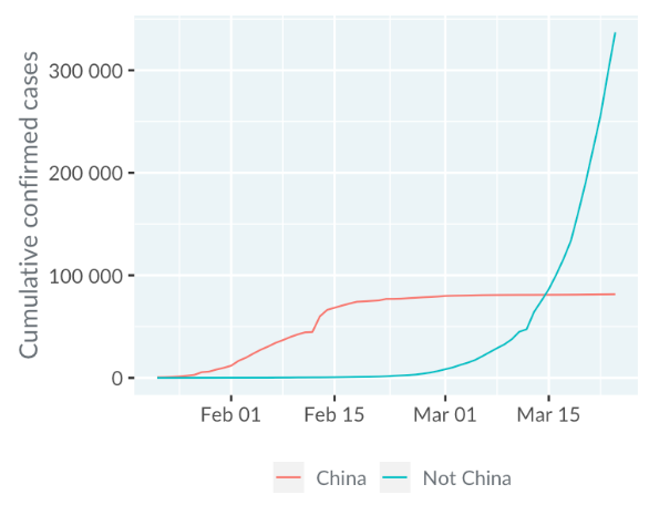
Line plots can compare multiple lines, like showing COVID-19 cases in different regions. For example, in February 2020, most cases were in China, but by March, the rest of the world had more cases.
Trend Lines and Log Scale
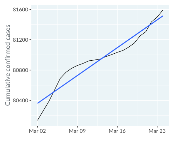
Trend lines from linear regression help analyze line plots. In China, March 2020 data showed a linear increase in cases post-quarantine.
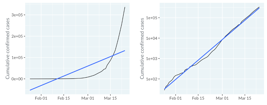
For other countries, using a logarithmic scale showed exponential growth in cases, fitting the trend line better.
Time x-axis and line plots
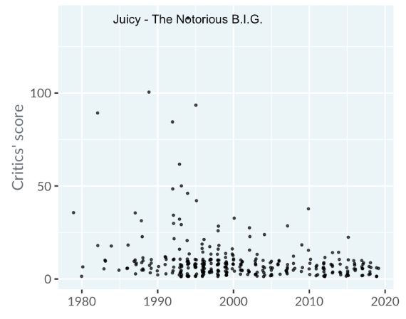
A time axis doesn't always mean a line plot is suitable. For instance, a scatter plot of hip-hop song ratings by critics, with dates on the x-axis and scores on the y-axis, is more appropriate since the songs aren't sequentially connected.
By the way: The top-rated hip-hop song of all time was "Juicy" by The Notorious B.I.G.
Sometimes, plots with a time axis may not be effective. For example, a plot of juvenile offenders in Switzerland by age group over time may not provide clear insights. Alternative approaches without a time x-axis might work better.
Case Study: Technology Adoption in the US
The following line plot illustrates the percentage of U.S. households adopting four technologies (automobiles, refrigerators, stoves, and vacuums) from 1930 to 1970.
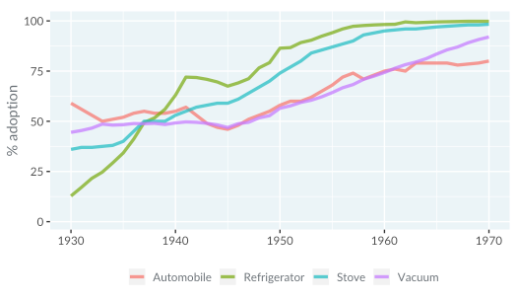
Reference: Hannah Ritchie and Max Roser (2019) - Technology Adoption
Observations:
- After 1940, refrigerator adoption consistently surpassed stove adoption.
- In 1930, car adoption exceeded 50%.
- In 1945, two out of four technologies had lower adoption rates than in 1940.
Case Study: COVID-19
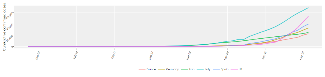
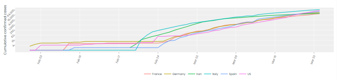
In this line plot of COVID-19 data, we're focusing on the six countries with the most cases outside mainland China. Both a logarithmic and linear scale is presented.
- On a linear scale, each grid line represents an addition of 20,000 cases.
- On a logarithmic scale, each grid line represents a multiplication by 4.
For datasets with values spanning several orders of magnitude, a logarithmic scale can make visualization easier.