Swiftlink





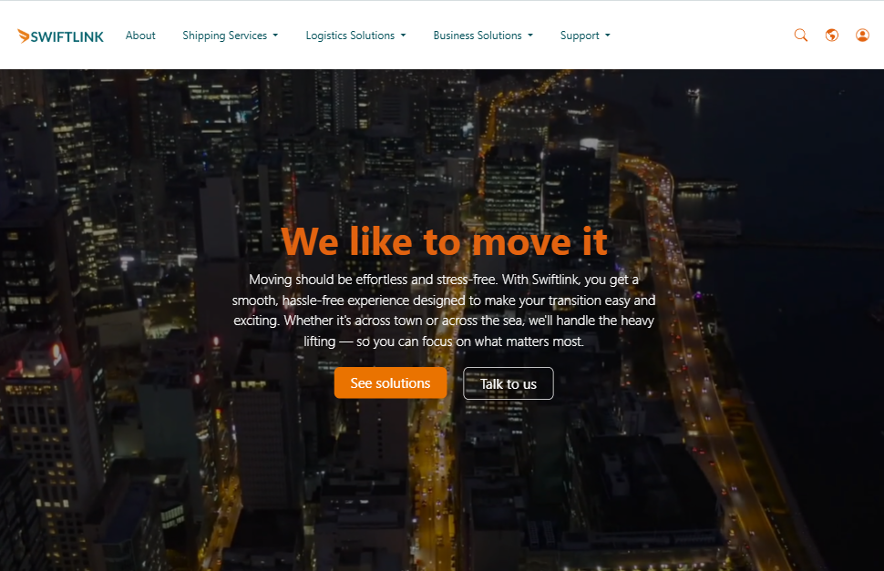
A responsive landing page for a fictional transportation and logistics company, built with HTML, CSS, JavaScript, and Bootstrap. Deployed on Netlify.
Screenshot
Technologies Used
- HTML, CSS, JavaScript
- Bootstrap Modals, Grid, OffCanvas
- Netlify for deployment
- Mailchimp for newsletter/contact integration
Key Features
A brief overview of the design elements and user-facing features.
- Modern, responsive layout
- Adjusts cleanly from 320px up to large desktops
- Uses media queries and Bootstrap breakpoints
- Smooth scrolling and interactive UI
- CTA sections to guide users
- Service highlights and animations
- Contact form
- Collects basic customer inquiries
- Integrated with Mailchimp
Navbar
The navigation bar provides quick access to all major sections of the website. It adapts to different screen sizes and includes both desktop and mobile-friendly elements.
-
Sticky top navigation
- Remains fixed at the top of the screen during scroll
- Improves accessibility to key sections at all times
-
Logo on the left
- Displays company branding
- Clickable to redirect users to the homepage
-
Main menu (center for desktop, offcanvas for mobile)
- About, Shipping Services, Logistics Solutions, Business Solutions, Support
- Dropdowns used for multi-option categories
-
Right section links
- Search, Global settings, and Login
- Icons accompanied by text labels for clarity
-
Responsive design with toggler
- Offcanvas menu triggered for smaller screens
- Same links and dropdowns are adapted for mobile view
Navbar Breakpoint Behavior
| Screen Width | Navbar Behavior |
|---|---|
| ≥1321px | All navbar items visible |
| 1130px – 1320px | Right-aligned labels hidden; icons only |
| 401px – 1129px | Left-aligned items hidden; toggler shown |
| ≤400px | Only logo and toggler are shown |
Additional Notes
The Navbar is built with Bootstrap's responsive utilities. It uses classes like navbar-expand-lg for expanding on larger screens and offcanvas for mobile. Dropdowns are used for menu items with multiple sub-options. Each link includes descriptive text and supporting icons to enhance usability.
OffCanvas Menu
OffCanvas Sidebar
offCanvas is used in this project to style the collapsible navbar. At 1129px and below, toggler opens a sidebar with vertically stacked nav items:
- About
- Shipping Services (dropdown)
- Logistics Solutions (dropdown)
- Business Solutions (dropdown)
- Support (dropdown)
OffCanvas Width by Screen Size
| Screen Width | OffCanvas Width |
|---|---|
| 768px – 1129px | 50% of screen |
| 400px – 767px | 70% of screen |
Offcanvas Sidebar Behavior
This section describes the interactive behavior of the Bootstrap 5.3 offcanvas sidebar when used on screens 1129px wide and below.
- Toggler icon opens the sidebar and dims the background
- Close button hides the sidebar and removes the dim
- Clicking outside the sidebar closes it and removes the dim
- Clicking non-dropdown links inside the sidebar:
- Closes the sidebar
- Navigates to the section
- Removes the dim
- Clicking a dropdown link inside the sidebar:
- Expands the dropdown
- Shows the child items
- Keeps the sidebar open
- Clicking a dropdown child item:
- Closes the sidebar
- Navigates to the section
- Removes the dim
Search Modal
Details on how the Search modal behaves in various user actions.
-
Modal closes when:
- User clicks the close button
- User clicks outside modal
- User presses "Search"
- User types a query and presses Enter
-
Modal stays open if:
- User presses Enter with an empty Search field
Login/Signup Modals
This script handles the opening, closing, panel-switching, and form validation behavior for the Login and Signup modal.
Opening Modals
-
Open and Close Modal
- Clicking the login icon opens the modal and defaults to the Login panel.
- Clicking the close button or clicking outside the modal closes it.
- When the modal closes, all input fields in both panels are cleared.
-
Switch Between Panels
- Users can toggle between Login and Signup without restriction.
- Switching panels also resets validation states and form fields.
Form Reset on Close
Closing the modal:
- Clears all input values.
- Resets validation state and
activepanel to Login.
Login Validation
Pressing Enter or clicking Continue checks that the Username field is not empty.
- If empty:
- Native browser validation is triggered.
- Default form submission is blocked.
Validation uses HTML5 form validation (required attribute) to show browser-native warning like:
"Please fill out this field"
Signup Validation
This is still a work in progress.
Sequential field validation: Prevents submitting the form (via Enter or "Sign Up" button) unless the following fields are all filled:
- Full Name
- Email Address
- Username
- Password
The first empty required field triggers the browser's built-in validation message.
- Uses
checkValidity()on the form - Ensure native handling of "Please fill out this field".
Banner (Video Hero Section)
The banner is a full-width hero section that creates an engaging first impression using a background video and a prominent message overlay. It provides key calls-to-action to guide user interaction.
-
Background video
- Plays automatically, loops continuously, and remains muted
- Provides a modern, dynamic visual to capture attention
-
Fallback image
- Displays when video is unsupported or loading
- Ensures consistent visual presentation across all devices
-
Overlay content
- Bold headline to introduce the brand message
- Descriptive paragraph explaining the service value
- Two prominent buttons:
- “See solutions” directs users to the shipping services section
- “Talk to us” connects users to the support section
-
Responsive layout
- Content and visuals adjust gracefully across screen sizes
- Ensures readability and interaction on both desktop and mobile devices
Responsiveness
The layout uses Bootstrap grid and utility classes to ensure mobile-friendliness:
- Text and buttons are center-aligned
- Video and image scale responsively to fit different screen sizes
- Overlay adapts its size and alignment on smaller viewports
Additional Notes
The banner section is optimized for performance and accessibility.
- Autoplay settings comply with modern browser policies.
- Fallback visuals ensure compatibility.
- The calls-to-action are placed to drive engagement and support navigation flow.
Carousel
The carousel section features an auto-sliding image gallery with manual navigation controls for a dynamic user experience.
-
Automatic slide transition
- Slides change every 3 seconds
- Pauses on hover is disabled for continuous motion
-
Navigation buttons
- Previous and Next buttons allow manual navigation
- Icons for intuitive control
-
Indicators
- Shows clickable buttons to jump to specific slides
- Active slide is clearly highlighted
-
Responsive design
- Ensures smooth experience across all devices
- Images scale accordingly for different screen sizes
Country Dropdown
Dynamically Populate Countries
To dynamically populate the country dropdown, I used a country-fetching Javscript:
- Fetch the list of countries using the Intl.DisplayNames API.
- Sort them alphabetically.
- Inject them into the
<select id="country">dropdown.
Initial script:
document.addEventListener("DOMContentLoaded", function () {
  const countrySelect = document.getElementById("country");

  const placeholderOption = countrySelect.options[0];
  countrySelect.innerHTML = "";
  countrySelect.appendChild(placeholderOption);

  // Get country names using Intl API
  const regionNames = new Intl.DisplayNames(['en'], { type: 'region' });

  const countries = Array.from(
    new Set(
      Intl.supportedValuesOf('region')
        .filter(code => /^[A-Z]{2}$/.test(code)) // Ensure ISO country codes
    )
  ).map(code => regionNames.of(code));

  // Sort alphabetically
  countries.sort((a, b) => a.localeCompare(b));

  // Append countries to the dropdown
  countries.forEach(country => {
    const option = document.createElement("option");
    option.value = country;
    option.textContent = country;
    countrySelect.appendChild(option);
  });
});
Then configured the section in HTML:
<body>
  <!-- Other sections above -->

    <div class="form-group">
      <div class="custom-select
                  supp-sec-3-select-wrapper">
        <select class="form-control"
                id="country">
          <option value="" disabled selected>Country/Region</option>
        </select>
        <img src="./icons/arrow-down.svg" class="dropdown-arrow" alt="arrow icon">
      </div>
    </div>

  <!-- Other sections below -->

  <script src="./src/js/fetch-countries.js"></script>

</body>
To use this approach, the browser must support the Intl.DisplayNames and Intl.supportedValuesOf APIs (available in Chrome 102+, Edge 102+, Firefox 103+, Safari 15.4+). I gave it a try, but it didn’t work, so I did some troubleshooting:
- Opened the browser’s DevTools ➔ Console
- Noticed errors like
Uncaught ReferenceErrorand 404s in the Network tab
To confirm support, run this in the console:
Intl.supportedValuesOf('region')
If your browser doesn’t support it, you’ll see an error like this:

Or from the script:
fetch-countries.js:14 Uncaught RangeError: Invalid key : region
    at Intl.supportedValuesOf (<anonymous>)
    at HTMLDocument.<anonymous> (fetch-countries.js:14:12)
(anonymous)	@	fetch-countries.js:14
Error:
Uncaught RangeError: Invalid key : region
This confirms the API isn’t supported in the current browser.
Workaround: Use a fallback list of country codes instead.
Using a Static Country List
Instead of using an API, I opted for using a static list of country codes. The script below populates a select dropdown with all countries using ISO 3166-1 alpha-2 codes and their display names.
- Generates country names from ISO codes
- Clears default options except placeholder
- Sorts country names alphabetically
- Appends each country as an option in the dropdown
This provides accurate, localized country listing without external APIs.
document.addEventListener("DOMContentLoaded", function () {
  const countrySelect = document.getElementById("country");

  // Save and clear the placeholder
  const placeholder = countrySelect.querySelector("option[disabled]");
  countrySelect.innerHTML = "";
  countrySelect.appendChild(placeholder);

  const regionNames = new Intl.DisplayNames(['en'], { type: 'region' });

  // Full ISO 3166-1 alpha-2 country code list
  const countryCodes = [
    "AF","AX","AL","DZ","AS","AD","AO","AI","AQ","AG","AR","AM","AW","AU","AT","AZ",
    "BS","BH","BD","BB","BY","BE","BZ","BJ","BM","BT","BO","BQ","BA","BW","BV","BR",
    "IO","BN","BG","BF","BI","KH","CM","CA","CV","KY","CF","TD","CL","CN","CX","CC",
    "CO","KM","CG","CD","CK","CR","CI","HR","CU","CW","CY","CZ","DK","DJ","DM","DO",
    "EC","EG","SV","GQ","ER","EE","SZ","ET","FK","FO","FJ","FI","FR","GF","PF","TF",
    "GA","GM","GE","DE","GH","GI","GR","GL","GD","GP","GU","GT","GG","GN","GW","GY",
    "HT","HM","VA","HN","HK","HU","IS","IN","ID","IR","IQ","IE","IM","IL","IT","JM",
    "JP","JE","JO","KZ","KE","KI","KP","KR","KW","KG","LA","LV","LB","LS","LR","LY",
    "LI","LT","LU","MO","MG","MW","MY","MV","ML","MT","MH","MQ","MR","MU","YT","MX",
    "FM","MD","MC","MN","ME","MS","MA","MZ","MM","NA","NR","NP","NL","NC","NZ","NI",
    "NE","NG","NU","NF","MK","MP","NO","OM","PK","PW","PS","PA","PG","PY","PE","PH",
    "PN","PL","PT","PR","QA","RE","RO","RU","RW","BL","SH","KN","LC","MF","PM","VC",
    "WS","SM","ST","SA","SN","RS","SC","SL","SG","SX","SK","SI","SB","SO","ZA","GS",
    "SS","ES","LK","SD","SR","SJ","SE","CH","SY","TW","TJ","TZ","TH","TL","TG","TK",
    "TO","TT","TN","TR","TM","TC","TV","UG","UA","AE","GB","US","UM","UY","UZ","VU",
    "VE","VN","VG","VI","WF","EH","YE","ZM","ZW"
  ];

  const countries = countryCodes.map(code => ({
    code,
    name: regionNames.of(code)
  }));

  countries.sort((a, b) => a.name.localeCompare(b.name));

  countries.forEach(({ name }) => {
    const option = document.createElement("option");
    option.value = name;
    option.textContent = name;
    countrySelect.appendChild(option);
  });
});
Switching from ID to Class
To improve reusability, I updated the script to use a class selector instead of a specific ID. This allows the same logic to apply to multiple dropdowns on the page.
- Replaced
getElementByIdwithquerySelectorAllto select all elements with a specific class - Used
forEachto loop through and populate each matching dropdown
This version supports multiple dropdowns with the class country-select, which makes the script modular and reusable across different parts of the page.
document.addEventListener("DOMContentLoaded", function () {
  const selects = document.querySelectorAll(".country-select");
  const regionNames = new Intl.DisplayNames(['en'], { type: 'region' });
  const countryCodes = [ /* ISO 3166-1 alpha-2 list here */ ];

  const countries = countryCodes.map(code => ({
    code,
    name: regionNames.of(code)
  })).sort((a, b) => a.name.localeCompare(b.name));

  selects.forEach(countrySelect => {
    const placeholder = countrySelect.querySelector("option[disabled]");
    countrySelect.innerHTML = "";
    if (placeholder) countrySelect.appendChild(placeholder);

    countries.forEach(({ name }) => {
      const option = document.createElement("option");
      option.value = name;
      option.textContent = name;
      countrySelect.appendChild(option);
    });
  });
});
Responsive Web Design
Common Screen Widths
| Device Type | Screen Width (CSS px) | Example Devices |
|---|---|---|
| Small phones | 320px | iPhone SE (1st gen), older Androids |
| Compact phones | 360px – 375px | iPhone SE (2022), Pixel 4a, Galaxy A series |
| Average smartphones | 390px – 414px | iPhone 13/14, Galaxy S23, Pixel 7 |
| Tablets / Large phones | 428px – 480px | iPhone 15 Pro Max, Galaxy Note series |
Recommendations:
- Use 320px as a baseline
- 360px is the modern safe minimum
- Test with breakpoints like
max-width: 575.98px,480px, and360px
DevTools Emulation
Used these values to add custom devices in Chrome DevTools:
| Device | Viewport (px) | Device Pixel Ratio | Resolution (px) |
|---|---|---|---|
| Z Flip (2020 & 5G) | 412 × 1004 | 2.625 | 1080 × 2636 |
| Z Flip 3 / 4 / 5 | 412 × 915 | 3.0 | 1080 × 2640 |
| Samsung Galaxy S23+ | 412 × 915 | 3.0 | 1080 × 2340 |
| Samsung Galaxy S24 | 412 × 915 | 3.0 | 1080 × 2340 |
| iPhone 16 Pro Max | 430 × 932 | 3.0 | 1290 × 2796 (est.) |
| iPhone 14 | 390 × 844 | 3.0 | 1170 × 2532 |
Adding a Custom Device
To simulate the device in Chrom DevTools:
- Open DevTools ➔ Toggle device toolbar
- Click device dropdown ➔ Edit ➔ "Add custom device"
- Fill in name, width, height, and DPR as above