Axes in Plots
Misleading Plots
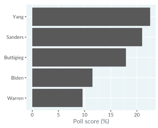
Bar plots rely on the length of each bar being proportional to the value it represents.

For example, in a misleading infographic from "dataisugly," Yang’s 22.5% poll score appears much larger than Sanders’ 21% score, even though the actual difference is minimal. This example highlights the importance of scrutinizing political graphs for accuracy.
Stacked Bar Plots
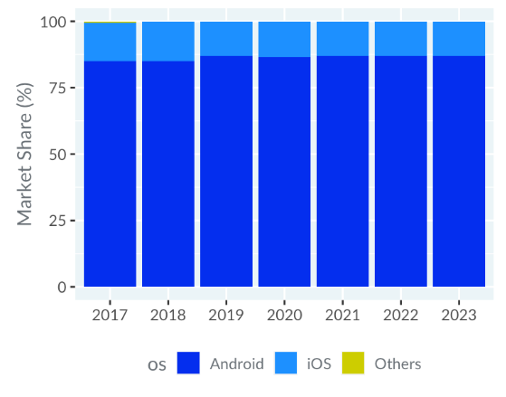
This issue also affects stacked bar plots. Another example from "dataisugly" shows a market share plot for phone operating systems where the y-axis starts at 75% instead of zero.
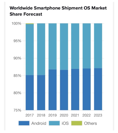
This adjustment makes Android and iOS market shares seem similar, whereas a correct plot reveals Android’s much larger share.
Dual Y-Axes
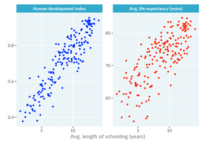
Dual y-axes can also be misleading. For instance, a plot using the United Nations dataset displays life expectancy and the human development index on separate y-axes.
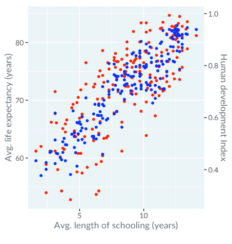
While this approach attempts to accommodate different scales, it can obscure the relationship between the variables. On one axis, there might appear to be a strong correlation, while on the other, the correlation seems absent, making interpretation challenging.
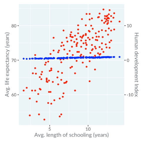
When we change the right-hand y-axis, the interpretation of the plot completely changes.
Multiple Panels
A clearer alternative is to use multiple panels. This way, you can separately present different metrics, making it easier for the audience to understand the data.