Project Page - Category Pills and Reset Button
Overview
On larger screens the projects page shows a two-column layout with a categories sidebar on the left for filtering.
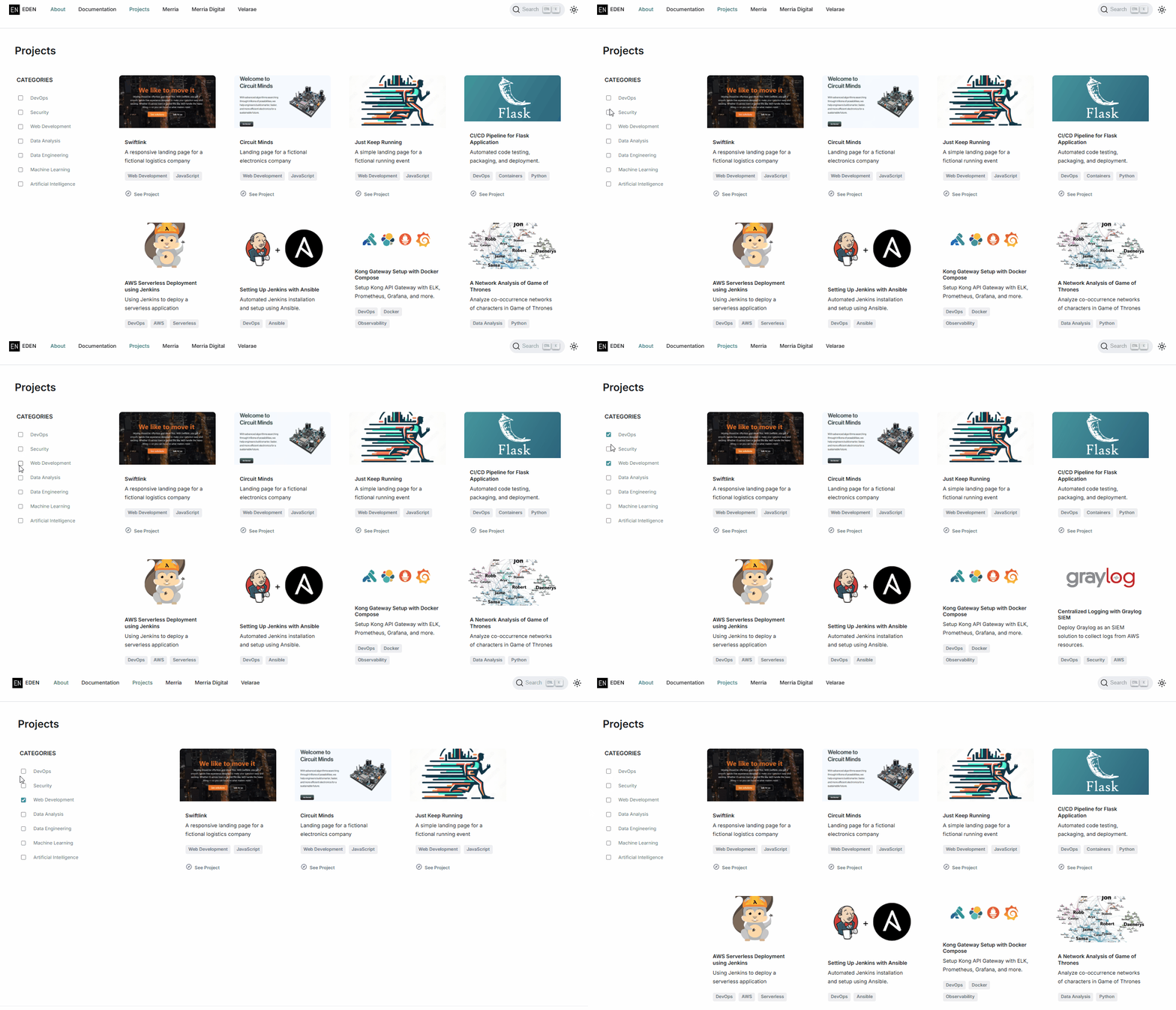
On screen sizes 897px and below, the original design hid the entire sidebar (see Step 6 in Designing the Project Page), which meant category filtering was unavailable on mobile.
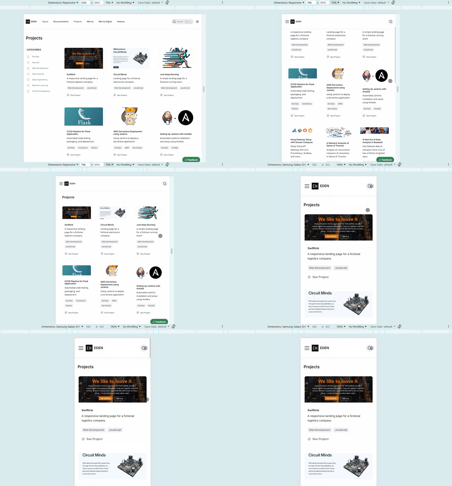
This page documents two follow-up changes:
- Keep category filtering on mobile screen sizes.
- Add a Clear All button that resets all active filters.
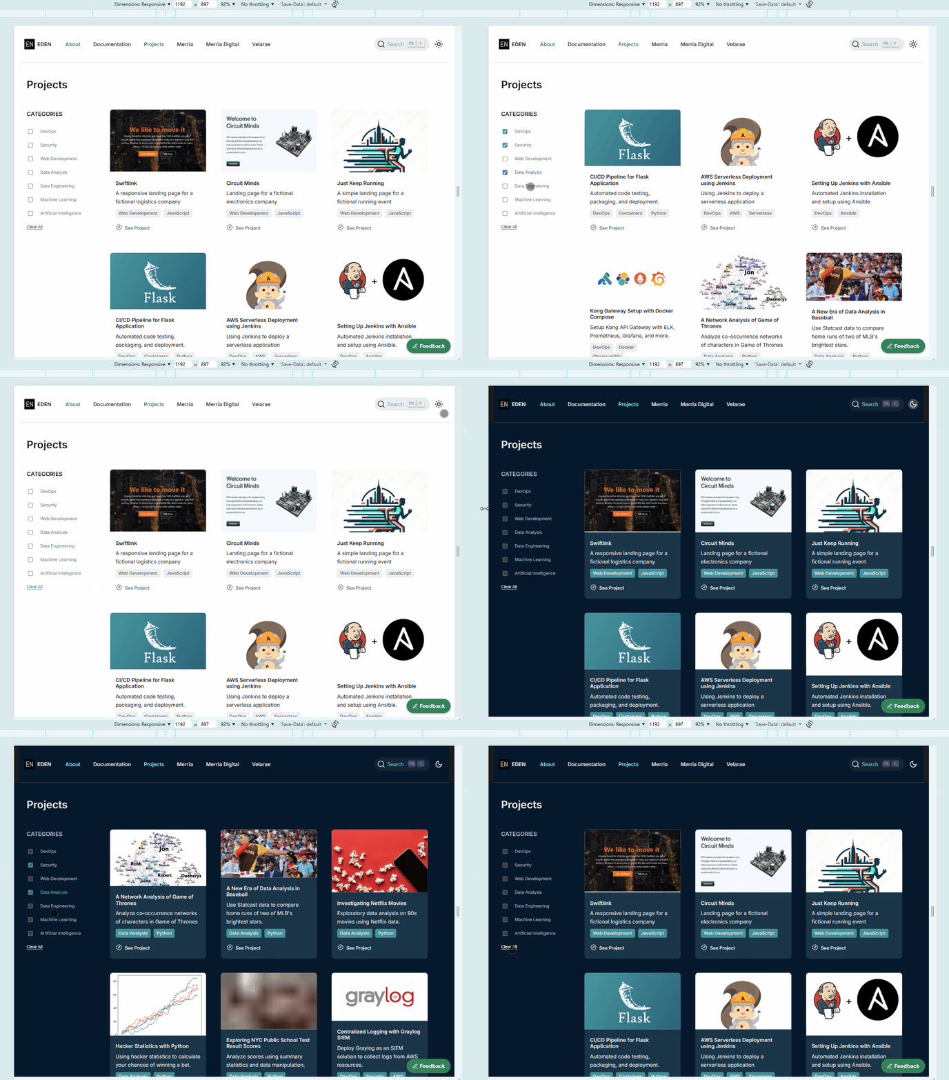
After the fix:
On large screens (light and dark mode):
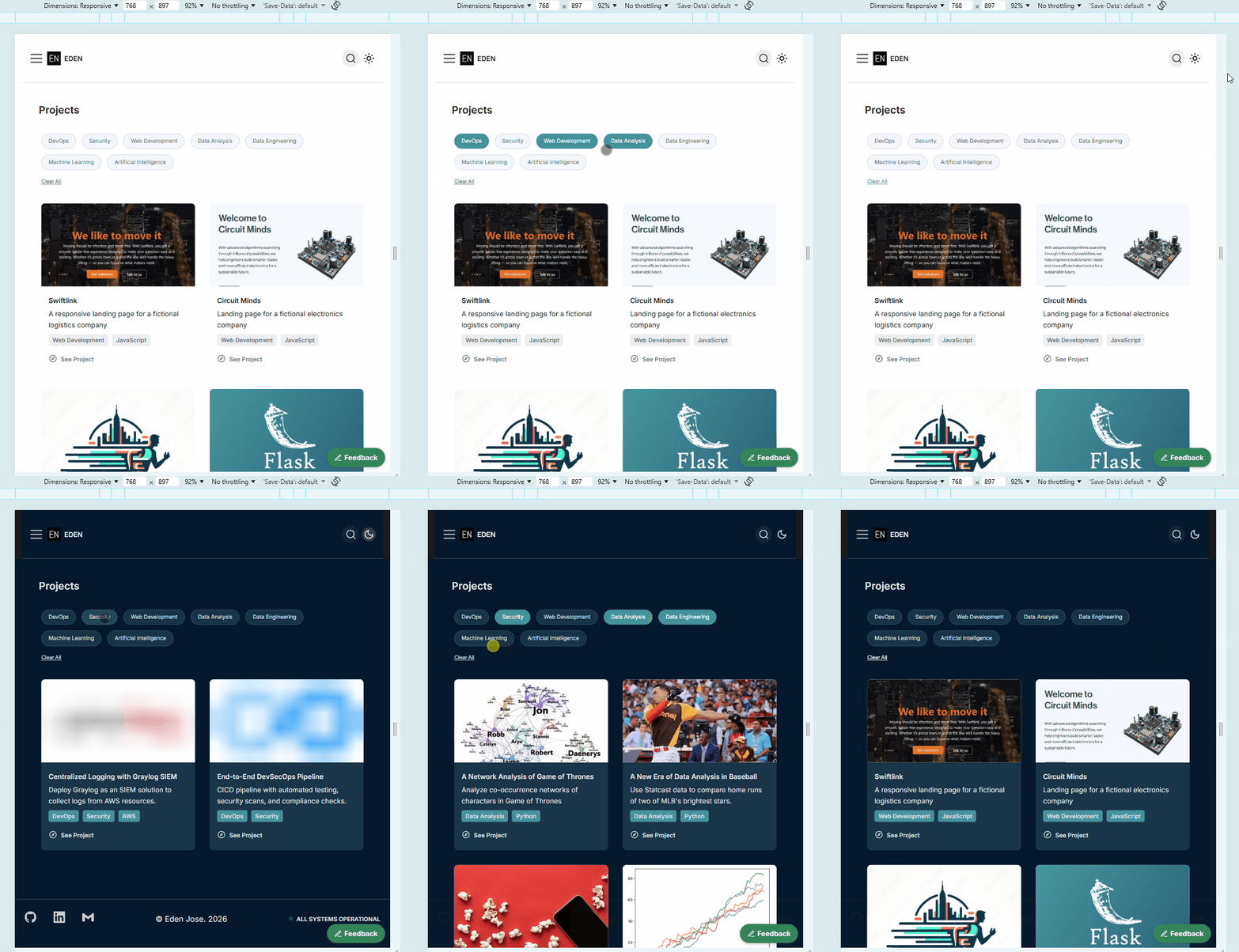
On mobile screens (light and dark mode):
Files Modified
| File | Change |
|---|---|
src/pages/projects.tsx | Always-visible Clear All button (always enabled) |
src/components/projects/Project.module.scss | Mobile pill styles (@media (max-width: 897px)), .clearAllButton, dark mode overrides |
Mobile Pill Buttons
Instead of hiding the sidebar, I converted the category list into pill-shaped buttons that is laid our in a row. The buttons also wrap across the top of the page.
Layout Change
The existing media query previously set the left column to display: none. This has been changed to keep it visible and switches the layout to a single column with two rows:
- Row 1: The pill buttons
- Row 2: The project cards
@media (max-width: 897px) {
  .pageContainer {
    grid-template-columns: 1fr !important;
    grid-template-rows: auto 1fr;

    .leftColumn {
      display: flex;   /* was: display: none */
    }
    ...
  }
}
Category List
The categoriesList switches from a vertical flex column to a horizontal flex row with wrapping enabled, so categories flow side by side and wrap to the next line when the row fills up.
.categoriesList {
  flex-direction: row;
  flex-wrap: wrap;
  gap: 12px;
}
Hiding the Actual Checkbox
The native checkbox input is visually hidden but kept in the DOM so the existing filtering logic (controlled React state) continues to work unchanged.
.categoryToggle {
  position: absolute;
  opacity: 0;
  pointer-events: none;
}
Pill Label
The label associated with each checkbox is styled to look like a pill button. Clicking the label still toggles the hidden checkbox, so no changes are needed in the TSX filtering logic.
.categoryLabel {
  display: inline-flex;
  align-items: center;
  justify-content: center;
  padding: 8px 14px;
  font-size: 11px;
  border: 1px solid #d2d7e2;
  border-radius: 999px;
  background-color: #f4f6fb;
  color: #4c566f;
  cursor: pointer;
  transition: background-color 0.2s ease, border-color 0.2s ease, color 0.2s ease;
}

.categoryToggle:checked + .categoryLabel {
  background-color: #40939b;
  border-color: #40939b;
  color: #ffffff;
}
Dark Mode
Also added dark-mode settings for the same breakpoint (897px and below).
[data-theme="dark"] .projectsPage {
  @media (max-width: 897px) {
    .categoryLabel {
      background-color: #163346;
      border-color: #2b5267;
      color: #d9e3e4;
    }

    .categoryToggle:checked + .categoryLabel {
      background-color: #40939b;
      border-color: #40939b;
      color: #ffffff;
    }
  }
}
Categories Header
The CATEGORIES heading is hidden on mobile since the pill buttons are self-explanatory in this context.
.categoriesHeader {
  display: none;
}
Clear All Button
The "Clear All" button will allow users to reset all active category filters in a single click, which will display all the projects again. This button is visible on all screen sizes.
Implementation
The "Clearn All" button is always rendered and always enabled. Clicking it calls setSelectedCategories([]), which clears the state and shows all projects again.
<button
  className={styles.clearAllButton}
  onClick={() => setSelectedCategories([])}
>
  Clear All
</button>
Styling
The button is intentionally plain (meaning it's not a pill button like the categories),so it reads as a utility action rather than a filter toggle. The underline indicates it's clickable, and a hover color change provides interactivity feedback.
.clearAllButton {
  margin-top: 16px;
  background: none;
  border: none;
  padding: 0;
  font-size: 0.8rem;
  color: #696f83;
  cursor: pointer;
  text-decoration: underline;
  text-underline-offset: 2px;
  display: block;

  &:hover {
    color: #40939b;
  }
}