CSS Flexbox
Early Web Layouts
Web pages were originally structured using basic HTML tables.
- Used
<table>,<tr>, and<td>elements - Allowed multi-column layouts by adjusting column widths
- Still useful for tabular data but not for layouts
Tables are not ideal for layouts because they mix structure with design, making updates difficult.
Transition to Display
To improve layouts, developers started using display properties.
display: inline-blockfor placing elements side by sideposition: absolutefor precise positioningfloat: left/rightfor arranging elements in columns
While these methods improved layouts, they introduced complexities in alignment and responsiveness.
The Problem with Floats
Floats were widely used but had drawbacks.
- Difficult to align elements properly
- Required clearfix hacks for layout stability
- Not designed for complex grid structures
Floats work well for wrapping text around images but are not ideal for building full-page layouts.
Using Flexbox
Flexbox simplifies layout creation with a flexible approach.
display: flexcreates a flex container- Items adjust dynamically based on available space
- Aligns items easily with
justify-contentandalign-items
Example: Creating a Flexbox Layout
Sample files: Github
<div class="container">
    <div class="box">Box 1</div>
    <div class="box">Box 2</div>
    <div class="box">Box 3</div>
</div>
.container {
  display: flex;
  gap: 10px;
}
.box {
  background: #66D2CE;
  padding: 20px;
  flex: 1;
}
Each .box will be evenly spaced inside .container, adjusting dynamically based on the available width.

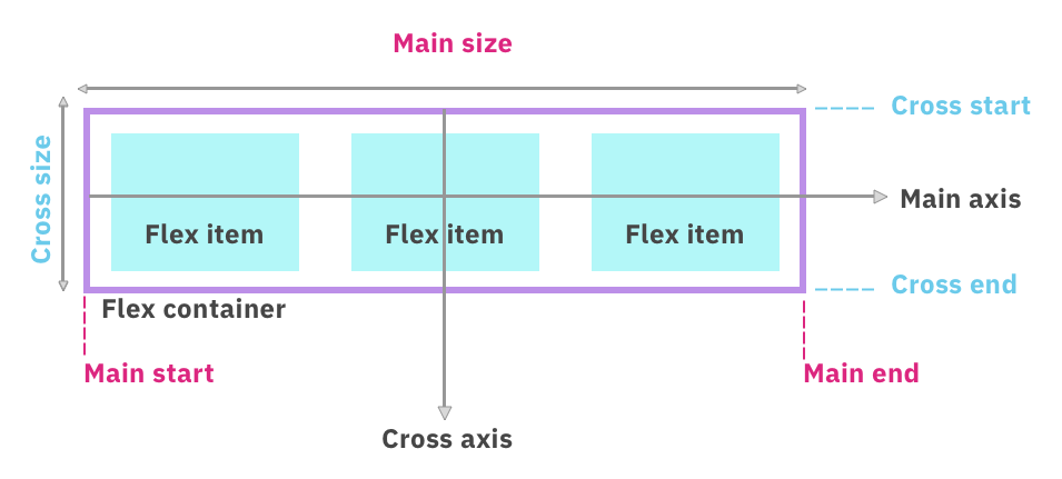
Main and Cross Axis
Flexbox layouts are structured around two axes:
-
Main axis
- Defined by
flex-direction row: main axis is horizontalcolumn: main axis is vertical
- Defined by
-
Cross axis
- Perpendicular to the main axis
- Helps control item alignment in the perpendicular direction
Flex Direction
The flex-direction property determines how flex items are arranged inside a container.
- Default value:
row(items align from left to right) column: items align from top to bottomrow-reverse: items align from right to leftcolumn-reverse: items align from bottom to top
Example: Modify the default layout using flex-direction:
.container {
  display: flex;
  flex-direction: column;
}
- Items now align top to bottom
- The main axis becomes vertical
- The cross axis moves left to right
Sample file can be found here: Github

Flex Basis
The flex-basis property controls the initial size of flex items along the main axis.
- In
rowdirection:flex-basissets width - In
columndirection:flex-basissets height - Applies to child elements, not the container
Example:
.container > * {
  flex-basis: 100px;
}

.container {
  display: flex;
  flex-direction: row;
}
- When
row, items have a width of100px - When
column, items have a height of100px - Helps control item sizes within a flex container
Using the previous example, we've set the flex-direction to column so each of the boxes will have a height of 100px.

If it was set to flex-direction: row, the flex-basis sets the width to 100px and the arrangement would look like this:

Control Order with order
The order property changes the arrangement of child items inside a flex container.
- Default order is
0, following HTML structure - Higher values move items further right
- Lower values move items further left
Example: Without ordering, the box items are arranged the same way they are defined in the
Sample files found in Github
If we set the order of the box 1 (red) to 1, we're moving it further down below the other elements which have a default order of 0.
.red {
  background: #D76C82;
  order: 1
}

.green {
  background: #66D2CE;
}

.blue {
  background: #578FCA;
}

Wrap Items with flex-wrap
By default, items stay in a single row and do not wrap.
nowrap(default) keeps items in one rowwrapmoves items to the next line when space runs outwrap-reversewraps items from bottom to top
.container {
  display: flex;
  flex-wrap: wrap;
}
Sample files: Github
Using flex-wrap ensures items don’t overflow and stay visible within the container.

Setting it to wrap-reverse:

Align Items with justify-content
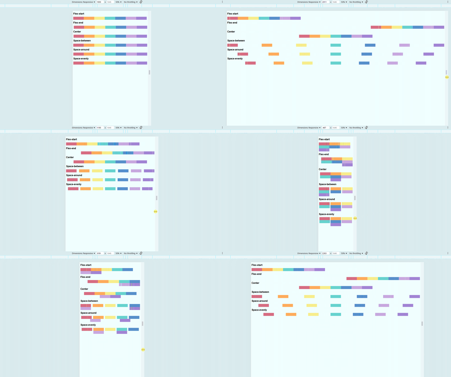
This property controls spacing along the main axis (horizontal by default).
flex-start(default) aligns items to the leftflex-endmoves items to the rightcentercenters itemsspace-betweendistributes items with space in betweenspace-aroundadds equal space on both sides of each itemspace-evenlyensures equal spacing everywhere
.container {
  display: flex;
  justify-content: space-between;
}
To view the sample files, check out Github.
You may also view the live demo here: CSS Justify Content
Align Items with align-items
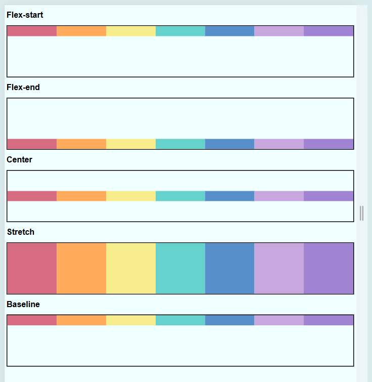
This property aligns items along the cross-axis (vertical by default).
flex-startaligns items at the topflex-endmoves items to the bottomcenteraligns items in the middlestretchmakes items expand to fill the container heightbaselinealigns items by their text baselines
.container {
  display: flex;
  flex-wrap: nowrap;
  align-items: center;
}
Using align-items helps in vertically positioning elements inside the container.
To view the sample files, check out Github.
Adjust Individual Items with align-self
This property overrides align-items for a specific child.
- Works like
align-itemsbut for a single item - Lets specific items behave differently from others
.item {
  align-self: flex-end;
}
For our example, we want to set all boxes to be aligned to the top, except for:
- orange - position at the center
- green - position at the bottom
To view the sample files, check out Github.

Align Content in Flexbox
Align-content controls how wrapped flex items are aligned along the cross axis.
- Works only with
flex-wrap: wrap - Affects how rows of flex items are spaced
- Different from
align-items
When items wrap into multiple rows, align-content decides how those rows are spaced. Without wrapping, this property has no effect.
Align-Items and Align-Content
align-items and align-content seem similar but behave differently.
align-items: Aligns individual items in a single rowalign-content: Aligns multiple rows of itemsalign-contentdoes nothing if all items fit in one row
When there is only one row, align-items is enough. But if flex items wrap, align-content helps control row spacing.
Common Values
Different values change how wrapped rows are positioned.
flex-start– Rows packed at the startflex-end– Rows packed at the endcenter– Rows centeredspace-between– Evenly distributed with no space at edgesspace-around– Evenly distributed with space around themstretch– Rows stretch to fill container height
Example:
.container {
  display: flex;
  flex-wrap: wrap;
  align-content: center;
  height: 300px;
  border: 1px solid black;
}

.item {
  width: 100px;
  height: 100px;
  background: lightblue;
  margin: 5px;
}
Expected Result:
- If flex items wrap, they will be centered vertically inside
.container. - Without
flex-wrap: wrap,align-contentdoes nothing.