iOS and Android
Updated May 02, 2026 ·
Button Rendering Issue on iOS
I ran into a problem where a button with text looks fine in Android browsers (single line), but on iOS, the text wraps into two lines. I tested on various devices and screen sizes using DevTools, but the issue still appeared on when viewed in browsers(Safari, Chrome) in actual iPhones.
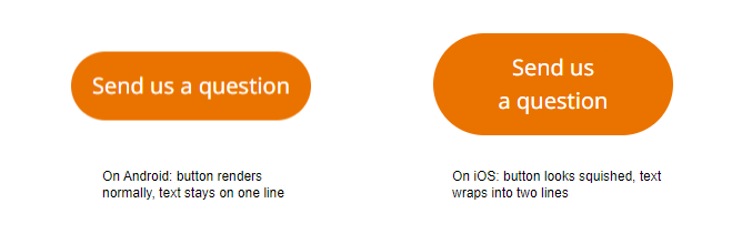
Possible Causes
The issue is likely due to how iOS and Android handle layout and text differently.
- Font rendering: iOS may display text slightly wider than Android
- Button size: The button may be too narrow on iOS devices
- Text wrapping: Text might not be set to stay on one line
- Viewport/meta tag: Improper scaling can affect layout on iOS
Possible Fixes
-
Stop text from wrapping
Force the text to stay on one line:
button {white-space: nowrap;}✅ This fix worked for me.
-
Make the button wider
Ensure the button has enough space:
button {min-width: 100px;padding: 0.5em 1.5em;} -
Use flexible units
Avoid fixed widths; go with responsive sizing:
button {width: auto;max-width: 90%;} -
Watch for text styling
Styles like
text-transform: uppercasecan change how wide text appears. -
Add viewport tag
Ensure your HTML has the correct viewport setting:
<meta name="viewport" content="width=device-width, initial-scale=1.0">