Mapping Data
Geographic Data
Maps help visualize location-based data, which makes it easier to spot patterns and make informed decisions. Tableau supports different types of geographic visualizations.
Types of Maps
Filled Maps
Colors entire geographic regions based on data. For example, different states in a country can be shaded according to population density.
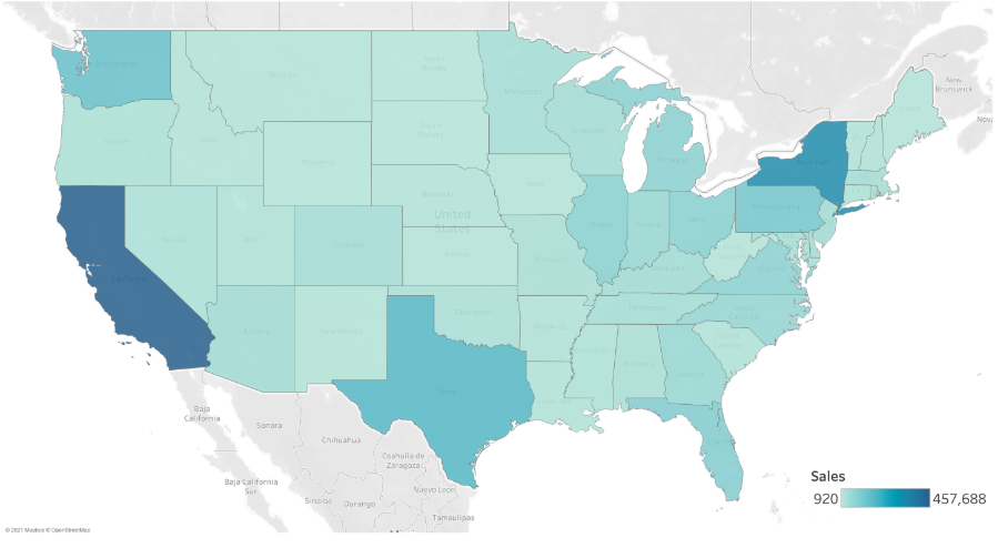
Symbol Maps
Uses symbols placed at the center of regions to represent data points. For instance, a circle in each state can indicate the number of hospitals.
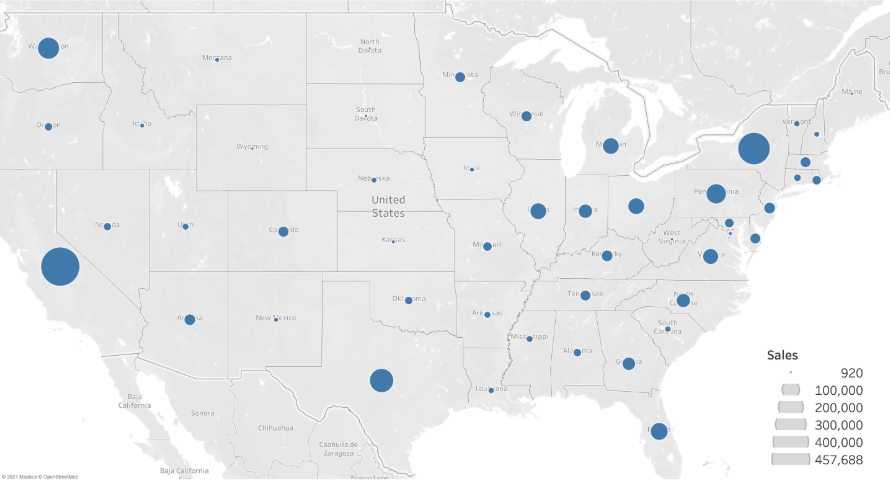
Recognized Geographic Types
Tableau automatically assigns coordinates (geocoding) to various geographic data types, including:
- Countries, states, and provinces worldwide
- US counties and congressional districts
- Cities and postal codes
- US area codes
Creating a Symbol Map
In this example, we’ll use a dataset from the World Health Organization (WHO) to analyze past global health statistics.
Download the workbook here: 2_1_WHO_health_stats_symbol_map.twbx
We'll start with mapping the lung cancer cases by country.
-
Add Geographic Data
-
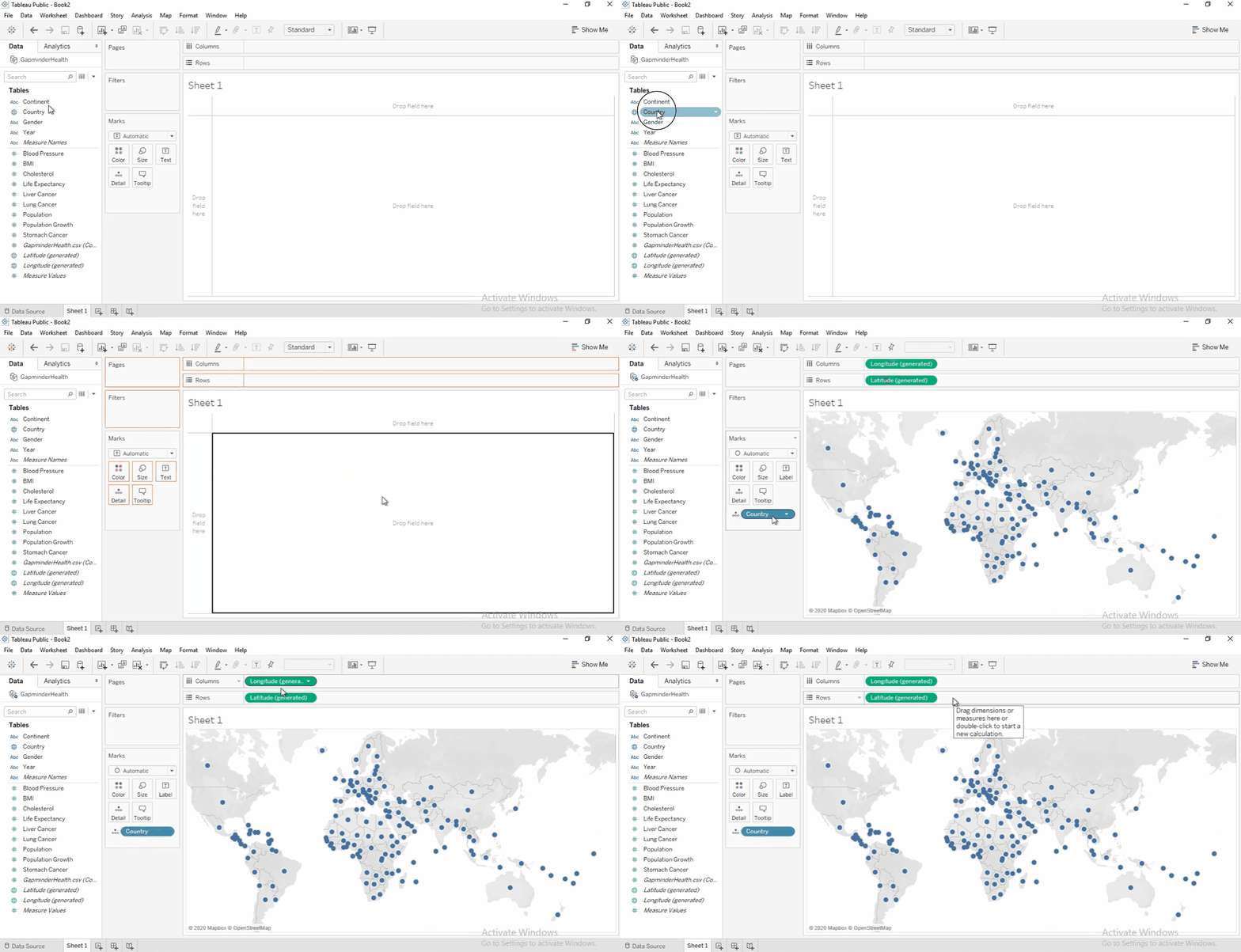
Drag the Country field to the view.
-
Tableau automatically add it to
Detailscard in the Marks shelf. -
It also generates latitude and longitude.
-
-
Filter by Year
-
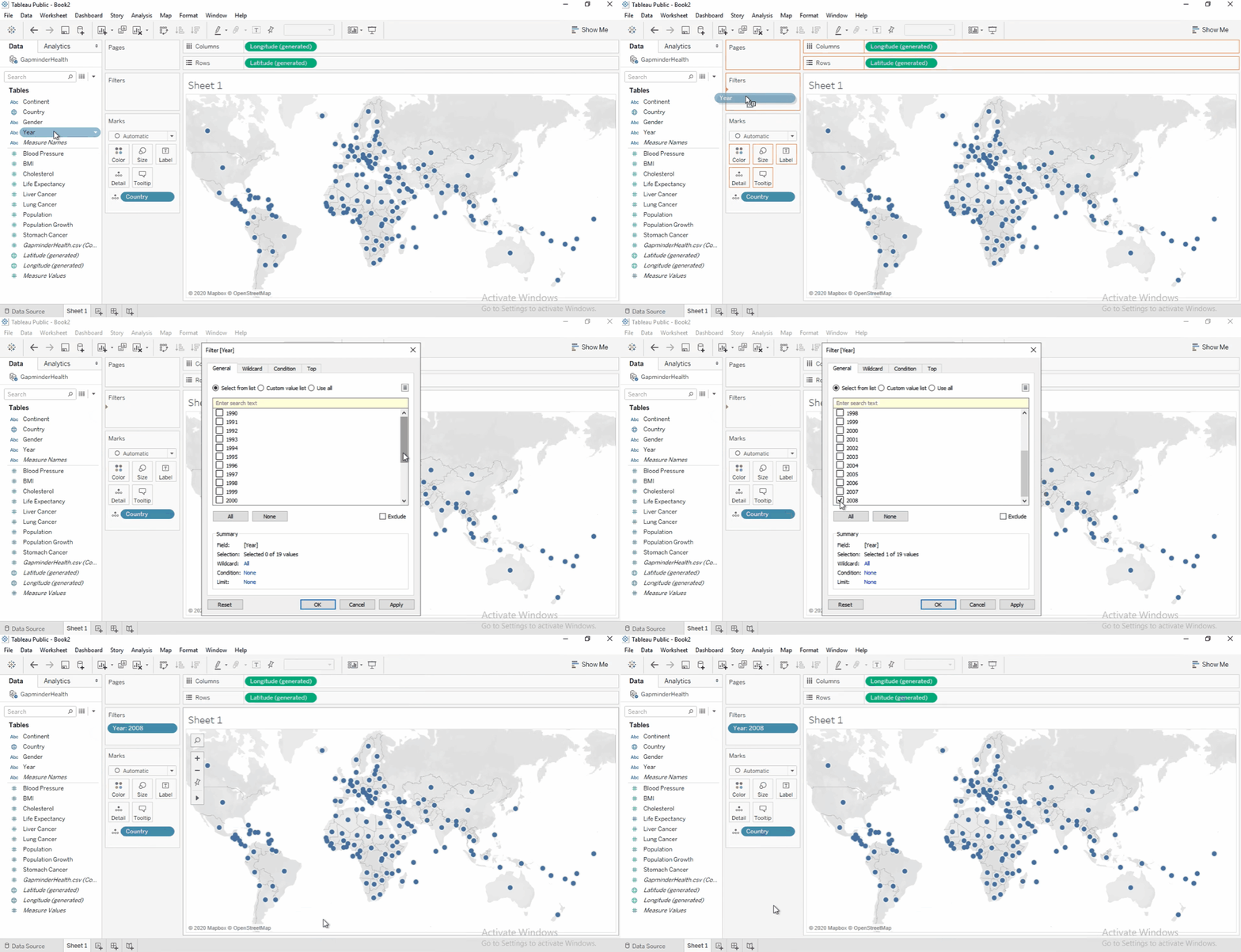
Add the
Yearfield to the FIlters shelf. -
Set the filter to 2008 to focus on the latest data.
-
-
Size by Measure
-
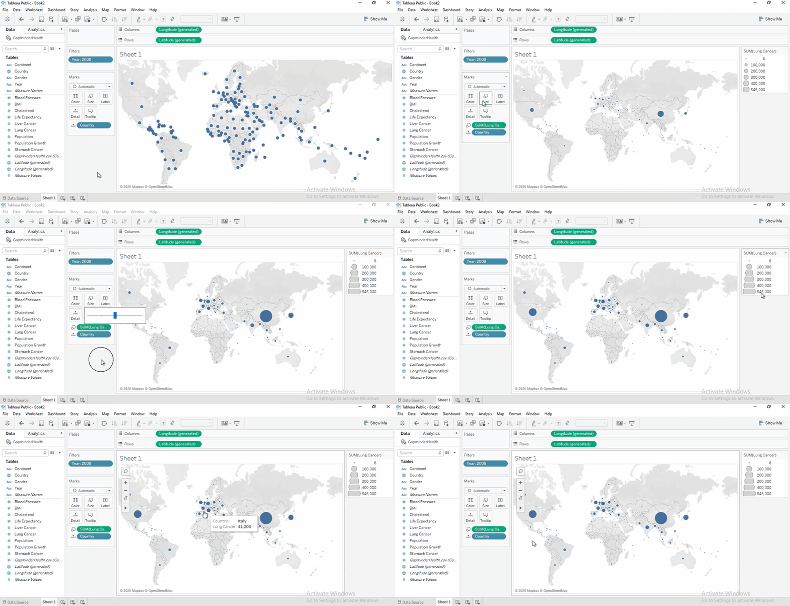
Drag Lung Cancer Cases to Size on the Marks card.
-
Larger circles indicate more cases.
-
To increase circle size, click Size and adjust slider.
-
-
Color by Population Growth
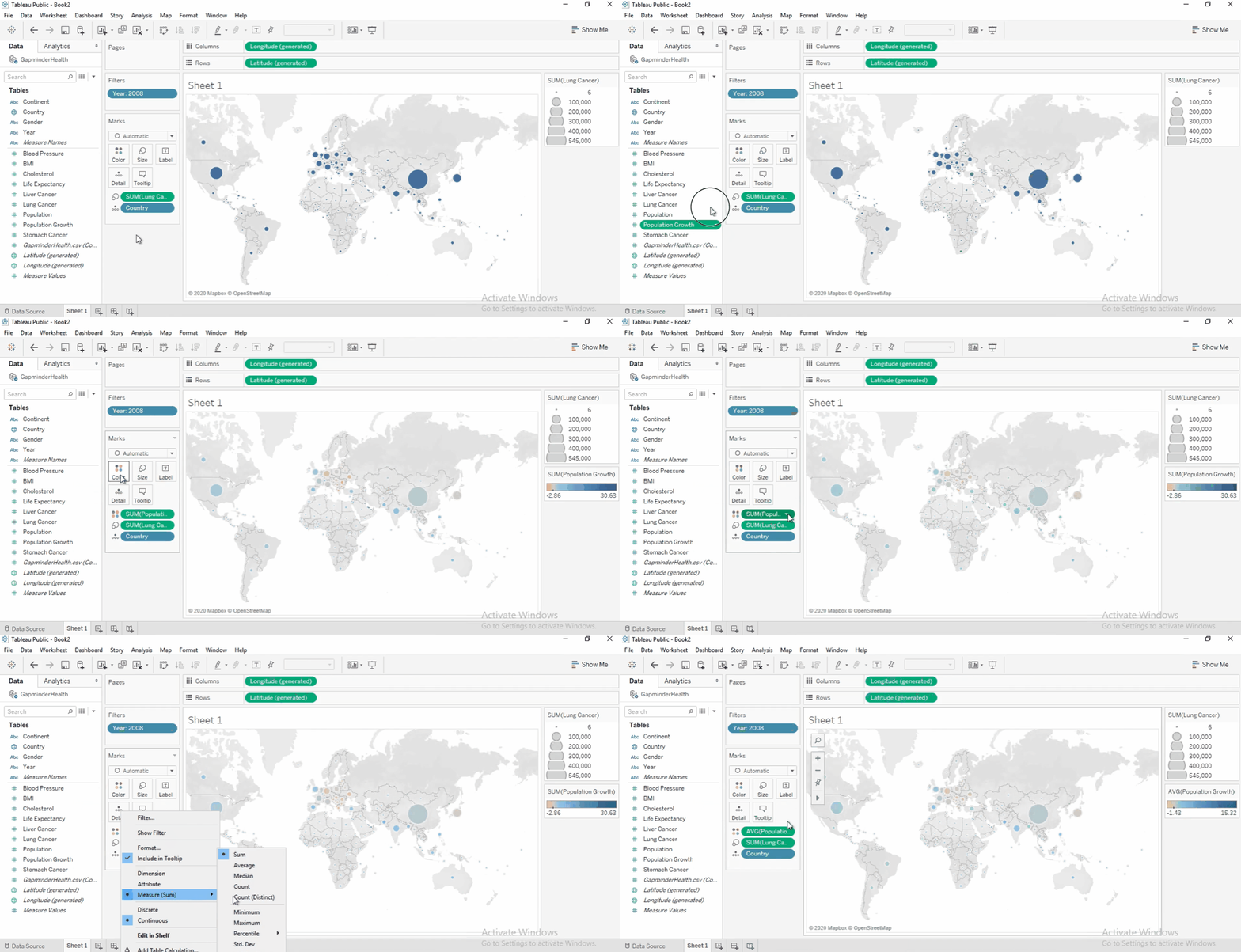
- Drag Population Growth to Color .
- Change aggregation to Average.
- Take note of the following:
-
Positive growth: Blue
-
Negative growth: Orange
-
-
Improve Visibility
-
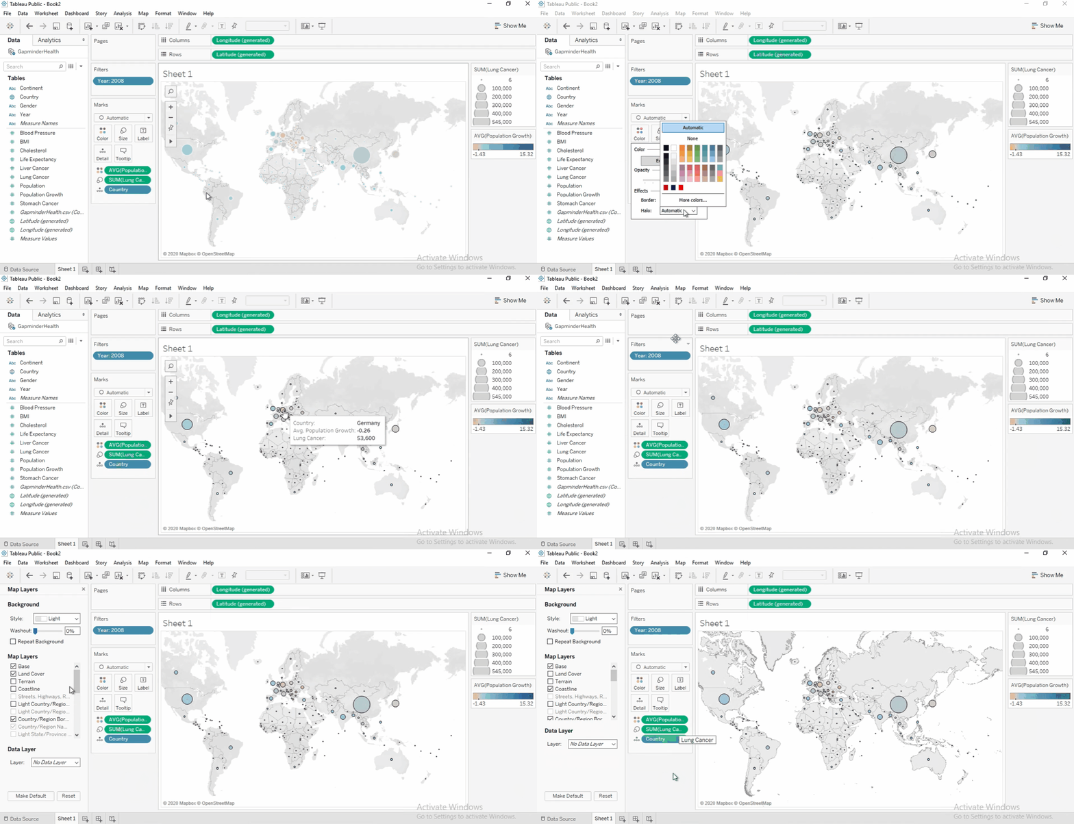
Click Color, add a black border, and remove the halo for clarity.
-
Adjust the map: Open Map Layers, deselect Land Cover, and select Coastline.
-